
TQ Legal: Rebranding a Live Barrister’s Website Without Breaking It
A complete rebrand of a live barrister’s WordPress site, shipped as an additive component layer alongside the legacy theme so nothing already live ever broke. A token-driven design system, a fully editable ACF page builder and a measurable enquiry journey, all with a zero-downtime rollout.
Project overview
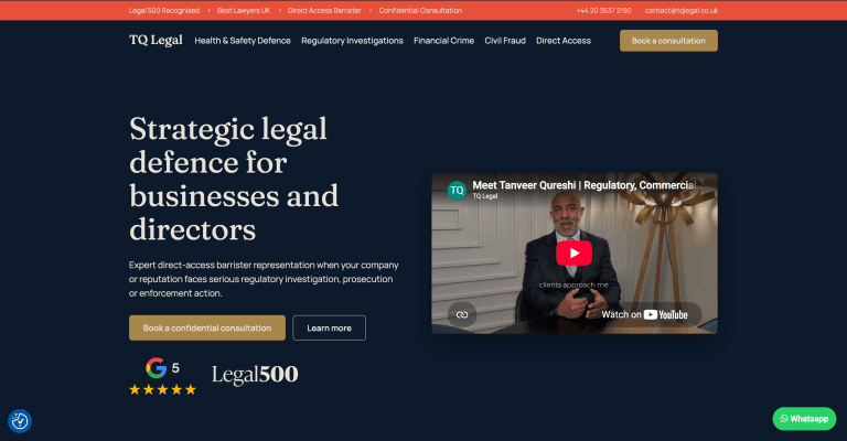
TQ Legal is the practice of Tanveer Qureshi, a UK barrister specialising in health & safety defence, regulatory investigations, ESG risk, commercial litigation, civil fraud and serious financial crime. Working with the client’s marketing agency, I rebuilt the public site into a new navy / gold / cream brand: a homepage and 5 practice-area pages, plus enquiry forms, booking, conversion tracking, cookie consent and a navigation tidy-up, all on top of the existing custom WordPress theme rather than a rebuild. Every page is an ACF flexible-content stack, so the finished site is fully editable by a non-technical owner: no copy, image or section lives hardcoded in a template.
The defining constraint shaped every decision: the old design had to keep working while the new one shipped. The rebrand rolled out as an additive “v2” component layer running alongside the original components, so the blog and every un-migrated page stayed visibly untouched throughout the build. The work overlaps most closely with custom WordPress theme development and ongoing WordPress support.
The challenge
A barrister’s website has one job: read as credible enough that someone facing a regulatory investigation or prosecution will pick up the phone. The existing site had a working component system and years of indexed content, but the design no longer matched the seriousness of the practice. The rebrand had to land a completely new visual identity, with a new palette, new typography and new layouts from Figma desktop frames, and do it without a rebuild, without breaking anything already live, and without ever taking the site down.
The legacy design, the blog and every existing page had to keep rendering exactly as before while a whole new design system shipped alongside them in the same theme.
The original stylesheet used global element selectors, ID-level rules and
!important hovers that bled into anything sharing its markup. The new design had to win every specificity battle without editing a line of legacy code.The Figma designs covered desktop only. Mobile and tablet behaviour, interaction states and animation were all developer judgement calls, reviewed against the client’s expectations after the fact.
Every heading, quote, icon, video and CTA had to remain an ACF field the owner can change in wp-admin, with the design system enforcing brand consistency regardless of what gets typed in.
What was delivered
I built the new brand as a second component layer inside the existing theme. Legacy components were never edited; each redesigned section became a new _v2 flexible-content layout with its own ACF fields, its own scoped CSS and its own registration in the page renderer, so old and new designs coexisted in the same install for the entire build. On that foundation I delivered the homepage and all five practice-area pages, then wired the conversion journey end to end: enquiry forms, Calendly booking, a thank-you page firing an analytics conversion, GDPR cookie consent and the go-live navigation swap.
The full palette, type scale and spacing live as CSS variables in one brand stylesheet loaded after the legacy CSS. When the client later supplied exact design values, retinting the entire site was a handful of token edits.
Redesigned heroes, practice-area grids, audience columns, feature lists, numbered steps, testimonials, FAQs, tick-list content blocks and inline contact sections, each a self-contained, escaped, field-driven PHP component sharing common helpers for backgrounds, colour schemes and media.
Gravity Forms restyled to the brand with inline validation and error states, every booking CTA opening a Calendly popup in-page, submissions redirecting to a branded thank-you page that pushes a lead-generation conversion event to GA4 via the data layer.
A shared image/video media toggle on key sections so photography can be swapped for the client’s films without a rebuild, Google-rating and Legal 500 trust badges, a downloadable directors’ guide on the Health & Safety page, and a scroll-reveal animation system that respects reduced-motion preferences.
Core functionality included
Every page is a stack of ACF flexible-content sections the owner can reorder, add or remove in wp-admin. The renderer switches on each section’s layout key and includes the matching component; new sections are two files and a registration away.
Each v2 section carries a colour-scheme field (navy, cream or coral) with the design’s alternating rhythm applied per page position, so editors can restack pages without breaking the visual cadence.
A bespoke line-icon set uploads as SVG through ordinary ACF image fields; a CSS filter chain normalises any icon to the correct foreground tone for its section, so one icon file stays legible on navy, cream and coral backgrounds alike.
Heroes, feature lists and content blocks accept either a photo or a YouTube/Vimeo embed via one shared field pattern. The client’s introduction and explainer films slot in per page, ambient-autoplay or click-to-play, without touching code.
Gravity Forms fully reskinned for both light and dark sections: white or outlined inputs to match the scheme, labels above, gold focus rings, coral inline errors and a form-level validation summary.
Every “book a consultation” CTA opens the Calendly scheduler as a popup rather than navigating away, keeping the visitor on the page and the booking measurable.
Google Tag Manager and GA4 wired through a thank-you page that fires a lead event on every successful enquiry, giving the agency clean campaign attribution for their advertising.
A consent banner with accept, reject and customise options, installed and wired alongside the analytics stack.
An IntersectionObserver-driven reveal system with staggered grid children and springing icons, gated so that reduced-motion users and no-JS visitors get a fully static, fully visible page with no flash of hidden content.
Legal 500 and Google-rating badge rows on heroes and testimonial sections, a static three-quote testimonial layout replacing a third-party review widget, and a Bar Standards Board regulation line in the footer.
A compressed, cover-imaged PDF guide for company directors embedded on the Health & Safety page as a branded content section with a download CTA.
Privacy and policy pages were reskinned to the new brand purely through a body class and scoped CSS. The legacy components rendering them were never touched.
Key architecture decisions
The guiding principle was additive, never destructive. Rather than editing the components the live site depended on, every redesigned section became a new file with a new layout key, registered alongside the old ones. The legacy layer keeps powering the blog and any un-migrated page indefinitely; the v2 layer owns the rebrand. That one rule turned a risky in-place redesign into a safe, incremental rollout: at any point during the build, both designs were fully working in the same install.
Keeping the layers apart was mostly a CSS discipline problem. The legacy stylesheet styles bare elements and uses ID selectors with !important, so any v2 markup that borrowed a legacy class name silently inherited a decade of old rules, a lesson learned early when a reused navigation class broke the new menu. The fix became a standing convention: v2 markup uses only its own prefixed classes, all v2 CSS is scoped under the section wrapper, and on the rare occasion a legacy rule must be beaten, the override deliberately matches its specificity, ID for ID, instead of escalating a war of !importants. Full-bleed backgrounds and max-width constraints are always split across an outer and inner element, another rule written down after it bit once.
Field definitions follow the same additive pattern. New v2 field groups are registered in versioned PHP and injected into the existing database-defined flexible-content field at load time, with every injected sub-field run through ACF’s own validation so it behaves exactly like a natively defined one. Legacy field groups stay in the database untouched; the new ones ship through git.
v1 and v2 components coexist behind distinct layout keys; the brand stylesheet loads after the legacy one and is scoped so it cannot leak backwards.
Colours, fonts and spacing are CSS variables in one place. When exact design values replaced the eyeballed ones late in the build, the whole site recoloured from a few token edits.
Common concerns (colour scheme, background and custom-ID resolution, image/video embeds, trust-badge rows, icon rendering) live in one support file every v2 component calls, so behaviour changes ship once.
PHP-registered field groups plus ACF local JSON keep the editing experience reproducible across environments instead of trapped in one database.
Results and outcomes
The practice now has a site that finally matches its calibre: a confident navy, gold and cream identity across the homepage and all five practice areas, a measurable enquiry-and-booking journey, and a component system the owner and their agency can edit without a developer. And because the rebrand shipped as a parallel layer, the transition carried none of the usual redesign risk: the legacy pages and blog rendered identically on the day the new design went on as they did the day the project started.
Every legacy page and the blog remained pixel-identical throughout; the golden rule of never editing v1 components held from first commit to last.
A dedicated pass against the Figma dev-mode values brought typography, exact palette hues, spacing and section widths in line with the frames, down to the section-by-section background rhythm.
Form submissions and consultation bookings now flow through validated forms and in-page scheduling into analytics conversions the agency can attribute campaign spend against.
Copy, images, videos, icons, quotes, FAQs and CTAs are all fields; sections can be restacked per page and the brand system keeps the result coherent.
Reduced-motion users get a static page, keyboard users get visible gold focus rings, all output is escaped, and the whole build holds a zero-PHP-notices bar.
Design tokens, shared helpers, versioned field definitions and a documented component pattern mean future sections are additions, not archaeology.
Technology used
TQ Legal runs on WordPress with a bespoke theme and ACF Pro flexible content driving every page. The v2 design layer is hand-written CSS on custom-property design tokens with Fraunces and Manrope typography, scroll animation via a small IntersectionObserver script, and SVG line iconography tinted per section with CSS filters. Forms are Gravity Forms restyled to the brand; booking is Calendly’s popup widget; measurement is Google Tag Manager and GA4 with a data-layer conversion event on the thank-you page; consent is a GDPR cookie banner wired to the tracking stack.
Next steps
This case study covers the rebrand and rebuild of the core marketing site: the homepage, the 5 practice-area pages and the full enquiry journey. The next stage is the go-live close-off on production hosting (the redirect map for retired pages, final content sync and post-launch checks), followed by restyling the blog into the new brand and building out its article library, all on the same additive component system so nothing shipped so far needs revisiting.
If you’re planning a rebrand of a live WordPress site and can’t afford to break what’s already working, or you’ve inherited a legacy theme that needs a modern design system built alongside it, the most relevant starting points are usually custom theme development and ongoing support.
Looking for similar outcomes? Start with Theme Development and browse more project examples.
Best matched offer
This project is closest to Theme Development. Start there if you want a similar outcome.
Newsletter
Get useful WordPress emails
Practical fixes, cleaner SEO wins, and lessons from real builds.
What this proves
This project shows the kind of commercial problem the work is built around: clearer implementation, fewer technical compromises and a better path from website investment to business outcome. If you need a similar approach, explore Theme Development and practical implementation guides.
Keep exploring
Quick paths to related services, practical guides and real project examples, curated to help visitors move from curiosity to action.
Related services
Relevant case studies
Related guides
Custom WordPress Development vs Page Builders: What Actually Scales in 2026
Page builders are useful for speed, but custom WordPress development usually scales better when performance, S...
5 Mistakes Killing Your Conversions
Many websites fail to generate leads for simple reasons like vague messaging, weak calls to action and poor st...
20 mistakes clients make using WordPress
Many WordPress websites underperform because of avoidable issues like poor hosting, missed updates, weak SEO s...
Want Similar Results for Your Business?
Let's discuss how I can help scale your website with a custom solution tailored to your business needs. From performance optimization to complete redesigns, I deliver results that drive growth.
Free 30-minute consultation • No commitment required • For business ready